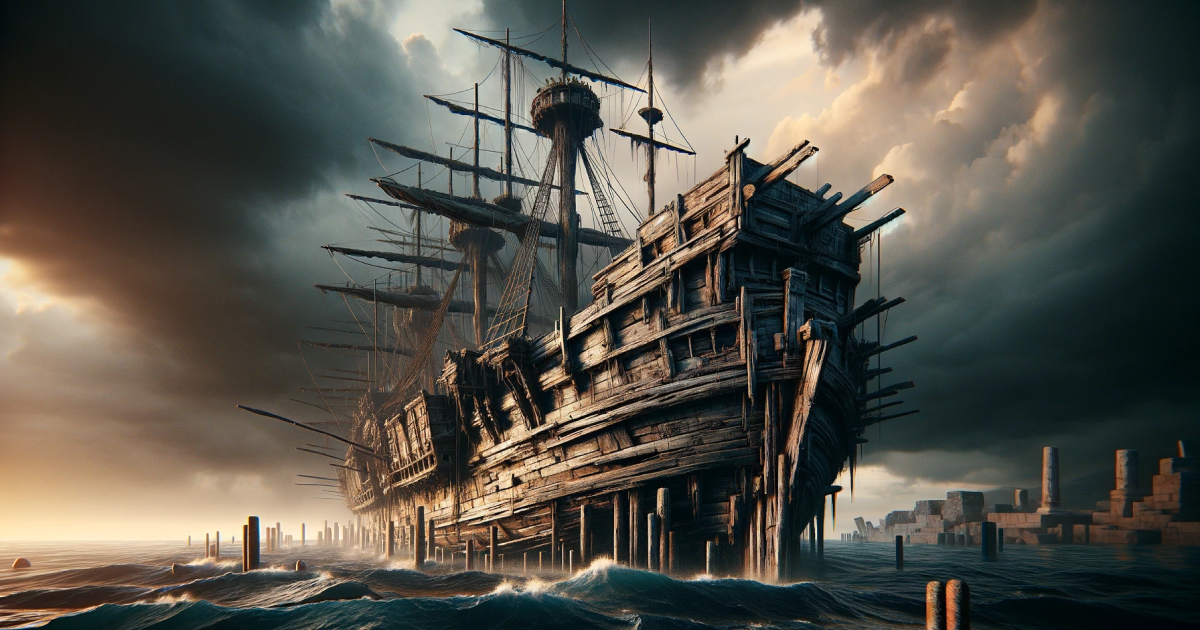
The Ship of Theseus asks if a thing that has all its parts replaced is still the same thing as it was before. In my formulation of this thought experiment, every product design should aspire to be the Ship of Theseus, where it stands to have every part replaced.
A good design – whether in architecture, product, or software – is a set of bones that stands up to continuous and evolving use over time. It is neither so rigid that it constrains the user or the producer, nor is it so loose that nothing can be built upon it. A good design provides building blocks to fulfill and support the goals of the people who need it to be what it is.
I’m proud to say that this website, my website that is, has been one of the most enduring ships that I have the fortune to sail in. Portfolio websites are notoriously one-off; they are meant to serve the job search. This website started off similarly, but over time has evolved into a garden that I tend to lovingly.
This is all very navel gazey, but here are some of the changes here made over the last few months.
Breaking the grid
The previous iteration of design has a strict adherence to grids. Everything was laid out in a strict 1.4 multiple of the baseline. This helps generate the great linear vertical rhythm on the page when multiple things are shoulder to shoulder. However, one of the side effects of this constraint is the limitation on font sizes since either they are too small or too big for the line height.
Alignment: you can’t hurt me no more
Rules are made to be broken, right? In this iteration, the introduction paragraph of every article is larger and off grid. The figure captions are smaller and break grids as well.
I’m no longer too worried about aligning everything. Key structures, for sure, because that is aesthetically pleasing. Everything else, maybe.
Interactivity and JavaScript
Another principle of the previous design was to have pages be completely static. The idea then was to have the site design be “back to basics”, building a website that is as stripped down as possible. I’ve since changed my mind. The site now works without JavaScript but uses JavaScript for glitter and glamor.
Here are the few changes:
- The elements are now card-like. Items highlight upon hover and interacts with the cursor. This is mostly cosmetic, but I do like how it makes the site feel more organic.
- The video player is styled with JS.
- There is now a gallery control. One challenge on project write ups is the sheer number of images. This helps make the page length more manageable.
Refinements to layout
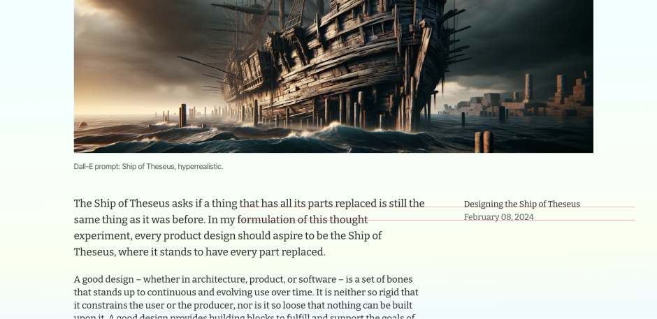
The third change is moving the article layout forward. Here’s an example.
Since AI, it became easy to generate images for articles, even when they are abstract. This not just makes pages more attractive because there is something to look at, it greatly helps with readability, especially when my writing meanders.
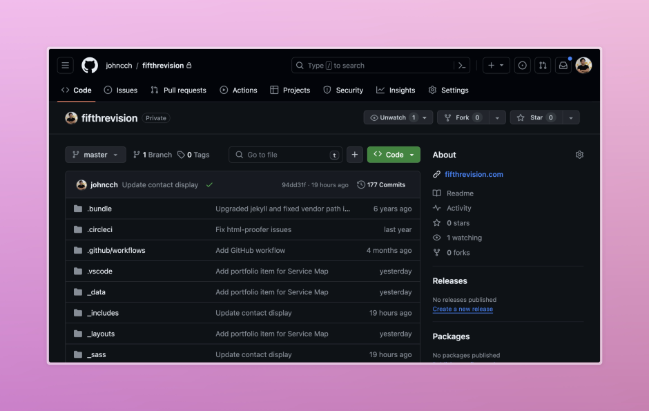
One hundred and seventy seven (177) commits in 7 years!
There are a litany of small changes that will not make this list. At this point, most layouts, CSS, words have been tweaked and modified a few times over. I count about 177 commits to the repository since 2017.
But as in the Ship of Theseus, is the site still the same site that it started from? I don’t know. What I know is whenever I am working in this codebase, in Jekyll, I’m very grateful and happy for it turned out to be. It’s been 7 years, and I’m looking forward to maintaining and evolving it for the next 10 years. Cheers to durable design!