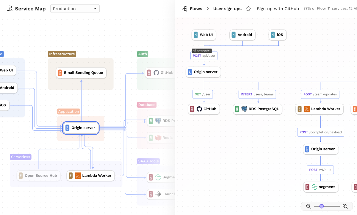
Codebases are rarely developed in isolation, especially in a services world. Software engineers have to consider how new features or fixes affect services upstream and downstream, and figuring out all of that today is a matter of building up an intimate repository of knowledge.
Our goal with Service Map is to build a tool that can visualize all the complexity. This way, engineers can have a tool that reflects their real environment at their fingertips that they can go to as they are learning, planning, and building new features.
TL;DR
- The first iteration of service maps provides a tool to inspect the service and record information within the team.
- Flows and traces were added help teams catalog all types of requests that goes through the service, and deeply inspect the data and call.
- Customer feedback was positive, “the best looking Service Map on the market”.
Research
As with every project, we start with building out our understanding of the domain and the user. My preferred method is a 1:1 interview, and we recruited software engineers from various backgrounds and vocations. Here are a few interesting takeaways:
- The number of services in a typical medium size company range from the mid tens to the upper hundreds in organizations that implement microservices. Most of the time, engineers work on a fraction of these systems. However, they will need to interop with other services which are managed by other teams in the company.
- Today, there are no easy ways for engineers to visualize their service topology. Knowledge about the system is captured in org charts, tribal knowledge, documentation, and methods of trial and error.
- Engineers have a reliance on documentation, automated or otherwise. Automated tools such as Swagger is especially critical when working with microservices, but may not always be available. Documentation is important but may not always be updated.
- Over time, engineers build up sufficient familiarity in parts of the system that they work in. However, if they have to switch projects or focus, they will have to ramp up again and relearn a new part of the system.
- Engineers are excited at the prospect of a tool that can help them inspect their service, especially if it contains information from production systems.
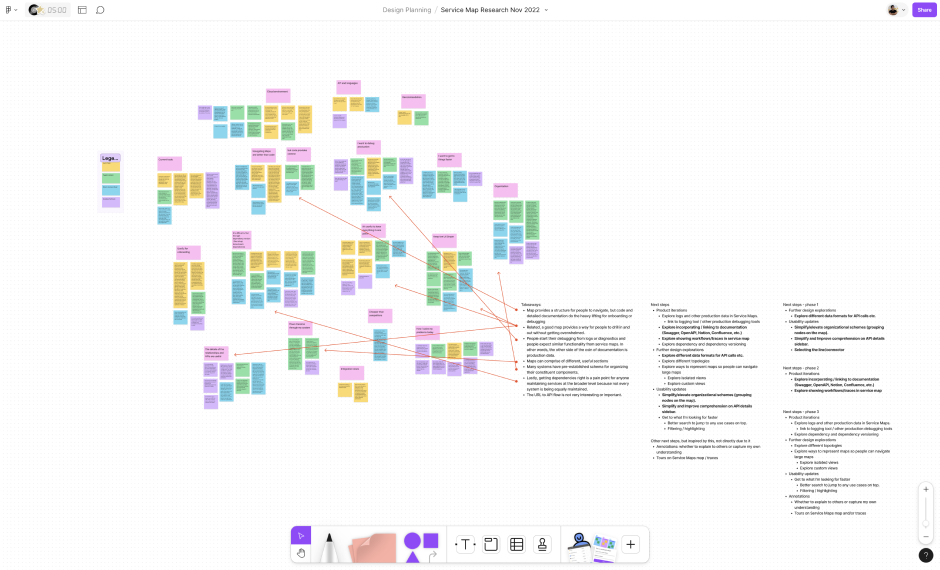
Research analysis as presented in Figjam, synthesized from user interviews.
Service map
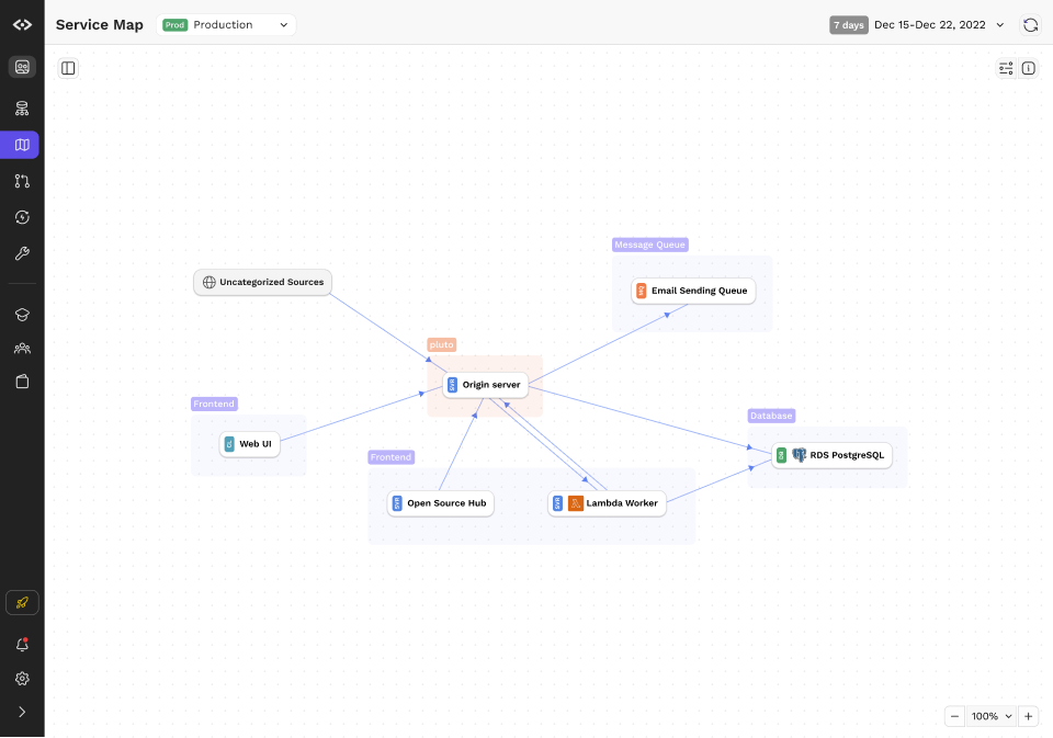
The first interaction design challenge is to design a map that properly represents a production system without overwhelming the engineer with details that may not be helpful to them when onboarding onto a system. In this case, we made a few decisions early on to facilitate understanding:
- Service Maps renders the logical topology. In other words, we chose not to visualize physical manifestations such as the number of servers or networking related nodes and interconnects.
- The map models data flows between services in the map. Typical calls in a system are modeled unidirectionally; REST calls, for example, is a single party request that returns a payload.
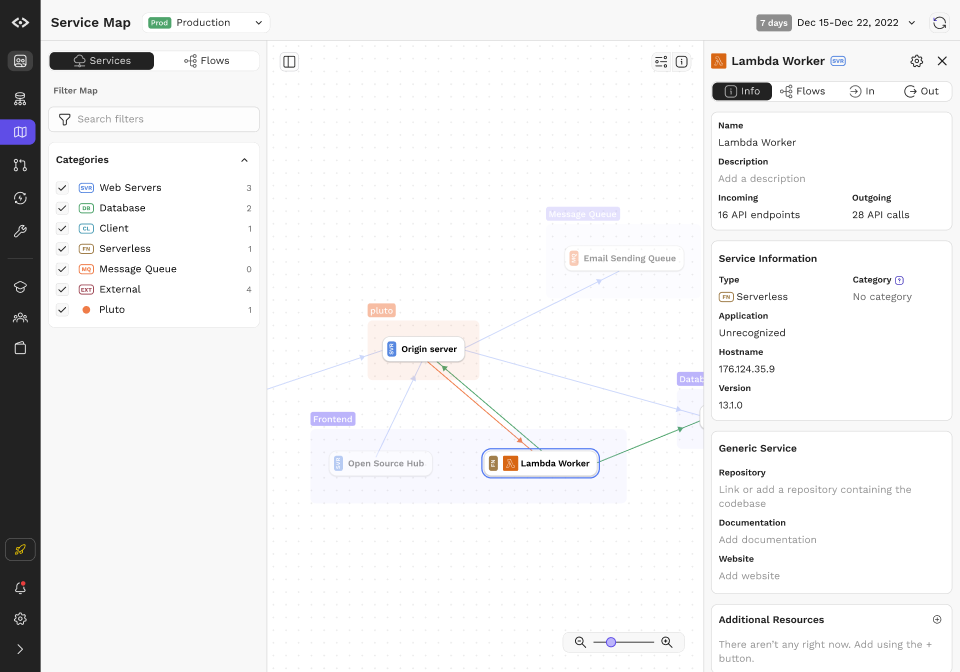
- Service Maps provide easy ways for engineering teams to label and group services. In organizations of any complexity, most engineers work in a fraction of the system, thus it is useful to be able to zoom out and into different parts of the topology.
- In addition to capturing the metadata and calls in and between services, service maps provide simple canvases for any engineer on the team to add and link knowledge. Source code can be linked so that engineers can dig in as necessary.
Flows and Variants
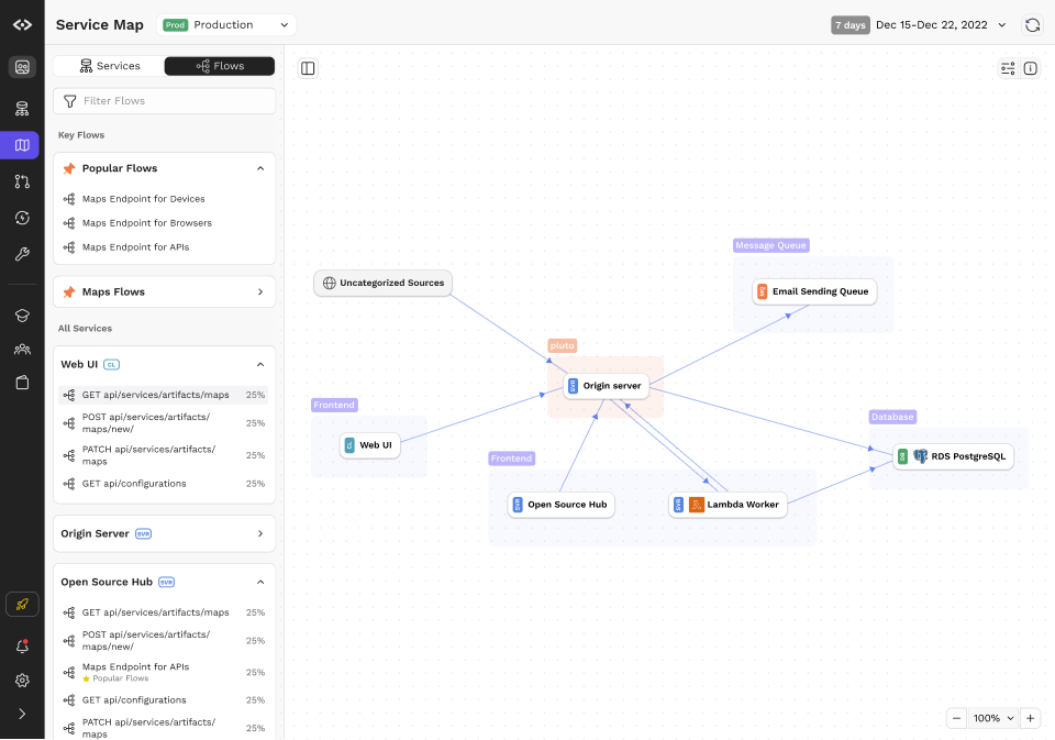
While topology and service calls are interesting, they often do not capture everything that an engineer may need to know. After all, services often have an variety of upstream and downstream services, each with different permutations of requirements and data model.
We introduced Flows to tackle the problem. Flows are objects that represent a set of call graphs anchored by the unique combination of method and URI on a leaf node. Even simple calls have multiple variations; for example, getting a list of objects will often depend on whether the user has permissions, whether the data is cached, or if there are feature flags involved. Flows aim to capture that and present that in an easy to understand manner.
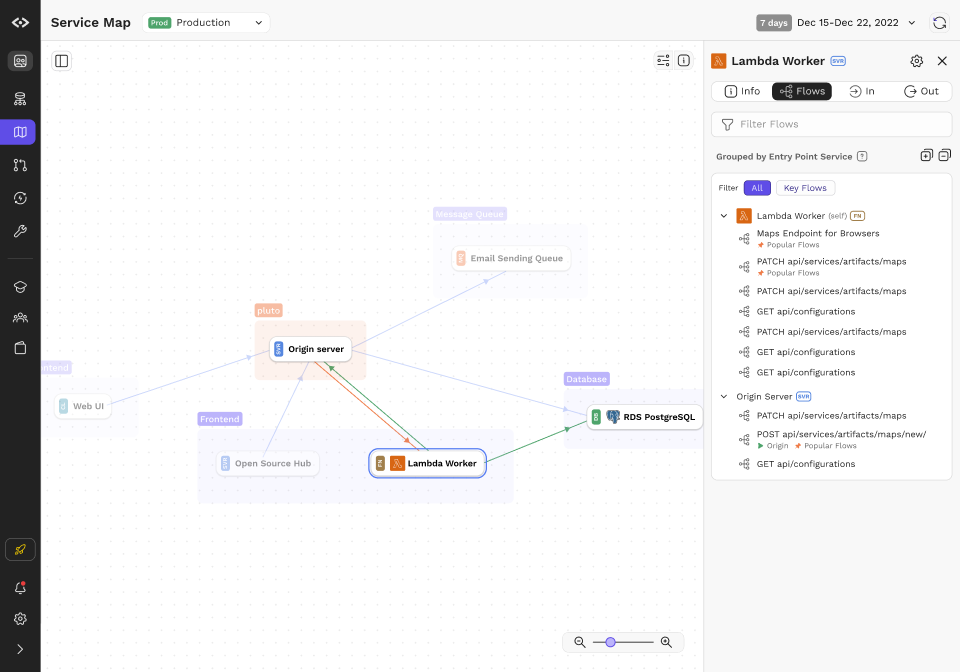
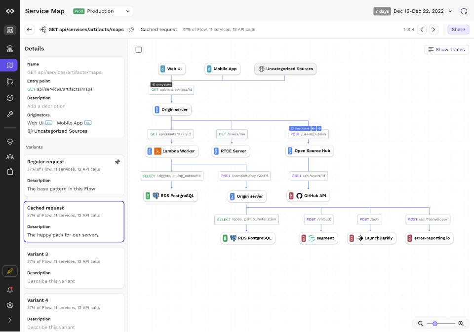
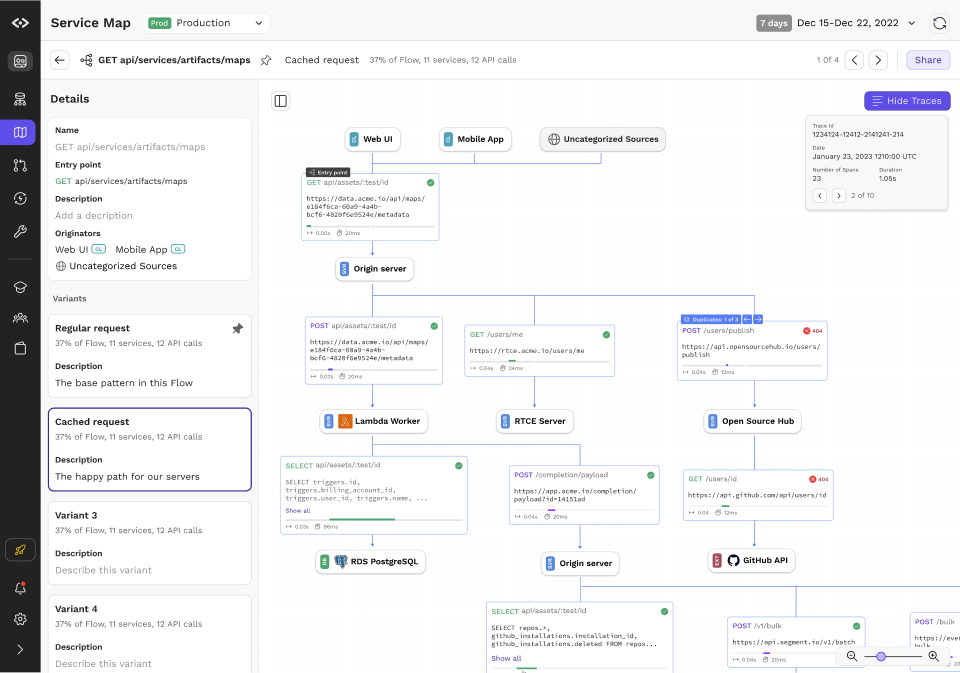
To make the graph concrete, engineers can load captured traces as an overlay over the Flow visualization. This way, they can page through the different examples, examine real data, gain full visibility and reduce the amount of guesswork required when building new features and services.
In Production
Here’s a video walkthrough of Service Maps in production running the OpenTelemetry demo.
Reception & aftermath
The design was fairly successful. For the use cases that we set out to solve, customers were really impressed, with one prospect noting that this is the best looking service map on the market.
That said, adoption was a challenge for a variety of reasons. First, the service map is useful only when it captures a significant portion of production data, and most legacy services are not set up to emit trace data; it is a set of engineering work that needs to be accounted for and prioritized over their business needs. This is compounded by the fact that organizations that need tools like this in the first place are large and also need to do the most work to set it up. The all or nothing nature makes go to market long and challenging.
In February 2024, CodeSee was acquired by GitKraken for their new DevEx platform.
