I was in a conversation in the Rands Slack group where we were lamenting the phenomena where everyone wants the thing they are working on appear above the fold. It’s a newspaper term, I believe, and it refers to the top half of the newspaper – that is the salacious, prominent half, visible on top of a stack in newsstands1. While newspapers are almost a relic of a past, above the fold is much alive and present.

That’s pretty good real estate for the business model. DALL-E prompt: Show me a newsstand in a futuristic city → Can you make the newsstand be part of a dense city block
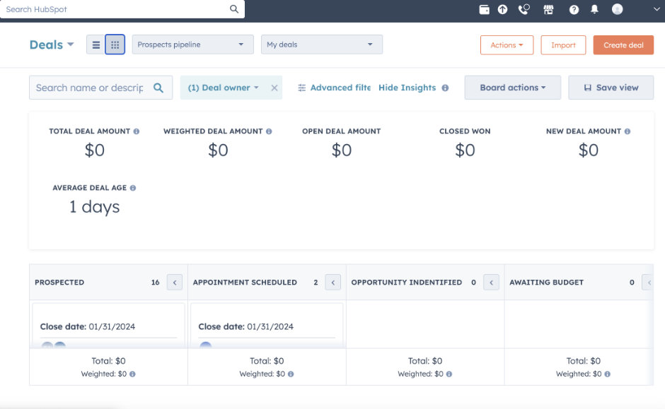
Here are a few ways to identify above the fold fetishes: unnatural amounts of information squeezed into the first page of a website, degrading the primary use case, in a bid to entice the user down other avenues. Incessant notifications, modals, or tooltips to draw attention to new additions. Multiple modules, many unprompted for and oft-changing, tetris-ed into the most visited page of an app.
It is easy to understand why this happens. As success of new features are tied to use and adoption, product teams are incentivized to ship the smallest thing and advertise them prominently on the most trafficked avenue. The goal is to get people to use the new feature… well, to get metrics to reflect usage so that there can be continued investment into it.
A close cousin of above the fold is easy to use. This comes in two flavors. In the first, ideas are stripped down to the bare minimum2, to some definition of small and lightweight, so that they can be shipped with as little engineering as possible. Thus, when the user clicks through, the feature falls short of its advertised benefits with the user left frustrated.
The other stems from the desire to reduce learning friction for the user. Changing workflows take time, energy and a concerted effort from the user. This is not inherently a bad thing, but is often poorly executed because the product team had a poor understanding of the user’s mental model or that learning, as undesirable as it may be, is unavoidable.

“Everything should fit in a single screen, yeah?” Real screenshot of an unnamed (not really) company.
I think about software shipped circa Office 95 and how different the software landscape feels today. It reflects a few changes in the industry: first, the switch from versioned software to a live service model. The transition of software as a tool to software as a service. Then, this enables ongoing skirmishes in searching and expanding traction. And lastly, a design zeitgeist over the past decade and half that prioritizes easy of use3 above all.
Let us bring back some software complexity.
One of the great things about software is that it can be whatever we want it to be. Software is a tool; a tool is only as powerful as the things that it can help people do. Instead of funneling them down one or two well trodden paths, we should strive to create tools that are able to support the full spectrum of needs and then some. Perhaps instead of the more of the sameness the pervades the internet these days, we may see a field of blossoming creations and ideas.
The tradeoff – and frankly pushback – is ease of use, cognitive friction and the engineering resources required to maintain a complex application. I would argue that while the paradox of choice and feature overloading can be true, it may be overstated, and honestly we currently on the other end of the pendulum swing where complexity is to be avoided at all costs. Furthermore, while it is often implied, it is not clear that the feature quantity and usability have an inverse relationship.
Instead of focusing on minimizing, reducing and curating, we designers should also be in the business of supporting, teaching, and empowering. There are design methodologies that can aid the user as they gain proficiency in a specific task. Modeling the right information architecture (instead of stuffing everything on the top level) can help users build up intuition on how to navigate the application. Progressive disclosure can be used to help reveal new functionality and options to users as they build up expertise. So on and so forth.

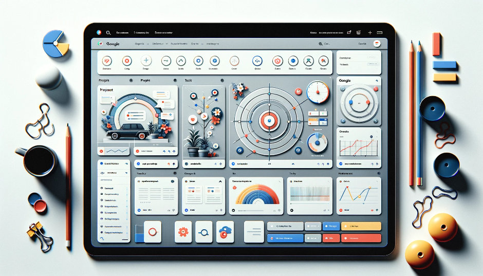
Material design. DALL-E prompt: Create an image of a software that is complex but easy to use → Give me variations and make it look like Google
We can and should support users beyond interaction design modalities well. Even when users are motivated to learn, many first party documentation or education materials are incomplete and half hearted at best. In my experience, people are often motivated to better themselves. They want to improve their skills and better leverage the tools that are made available to them. Learning and mastery is perhaps the most valuable tool to retain your user base, why treat it as an afterthought?
Lastly, to address the engineering question. Complexity in software architecture has increased exponentially over the past 10 years, but it is mostly done in favor of scale instead of customization. What this suggests to me is that engineering complexity is inherently achievable with a lot of focus and a little ingenuity. If we swing our attention to building software that mold and grow with our users, we will discover new patterns, architectures, and ideas for building software4.
This is admittedly a little theoretical, a little abstract. That said, I feel strongly that our incentives have been aligned in a wrong direction for a while now. Let us drive value through accomplishing more with our users. Software forgoes many of the constraints that we have in the physical world; we should celebrate and embrace that. Trust that users are able to handle more. Trust that they can seek out, level up. And finally, the software landscape that we are in should be as diverse and complex as the world that we inhabit.
-
What are newsstands, you ask? I would implore you to use the payphone and dial another friend. Bah, humbug. ↩
-
This article does not argue against MVPs, but just note that the V stands for viable. ↩
-
The success of Apple’s products have led to a pervasive view that ease of use is the most important attribute of a design. It may be true in some cases, but not always. ↩
-
One can argue that machine learning is a radical rethinking of what constitutes a software. Instead of relying on deterministic states, ML algorithms can leverage bayesian models to predict user actions. Perhaps even in this AI hype bubble that we are in right now, it is still severely underutilized. ↩