Over the last few weeks, I made a few design changes that had cascading effects on the rest of the site. At the risk of navel gazing, here’s a quick run down of the changes that transpired.
Revisiting Wide Layouts
One of the main goals in the previous few revisions is to have a layout that scales all the way from mobile devices to ultra-wide screen monitors. What I often see are single column designs that when presents at high resolution as thin sliver of text amidst a sea of white. What many of these layouts do is to adopt a 12 or 16 column grid that get width constrained; what I wanted to do was to break the grid model and introduce variable column grids that rearrange depending on the available width.
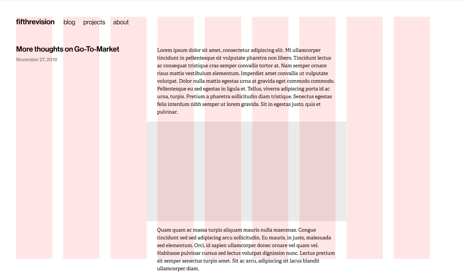
The last implementation was sound, but introduced a few wrinkles: many of the pages–like blog posts–have content that is concentrated in a single column. When the layout extends across the screen, depending on content there will be pages that look like islands of words unmoored and splayed all over the page. The position of the navigation, anchored to the top left corner, dictated a left-aligned layout which made the problem more acute.

The previous post layout can often feel lopsided.
This update introduces a new navigation block that is laid out orthogonally from the viewport’s lengthier axis. It then frames a block of space that allows the remainder content block to cluster or spread depending on the needs of the content. For posts, for example, content stays tight and fills up as required. For the portfolio, the grid extends depending on what’s available. In addition, the navigation is now consistently placed across all pages.
In practice, this is implemented as a nested set of grids. This worked well for the original design intention, with a limitation of it not being properly set for resolutions beyond 2560 pixels.
Baseline Aligned Typography
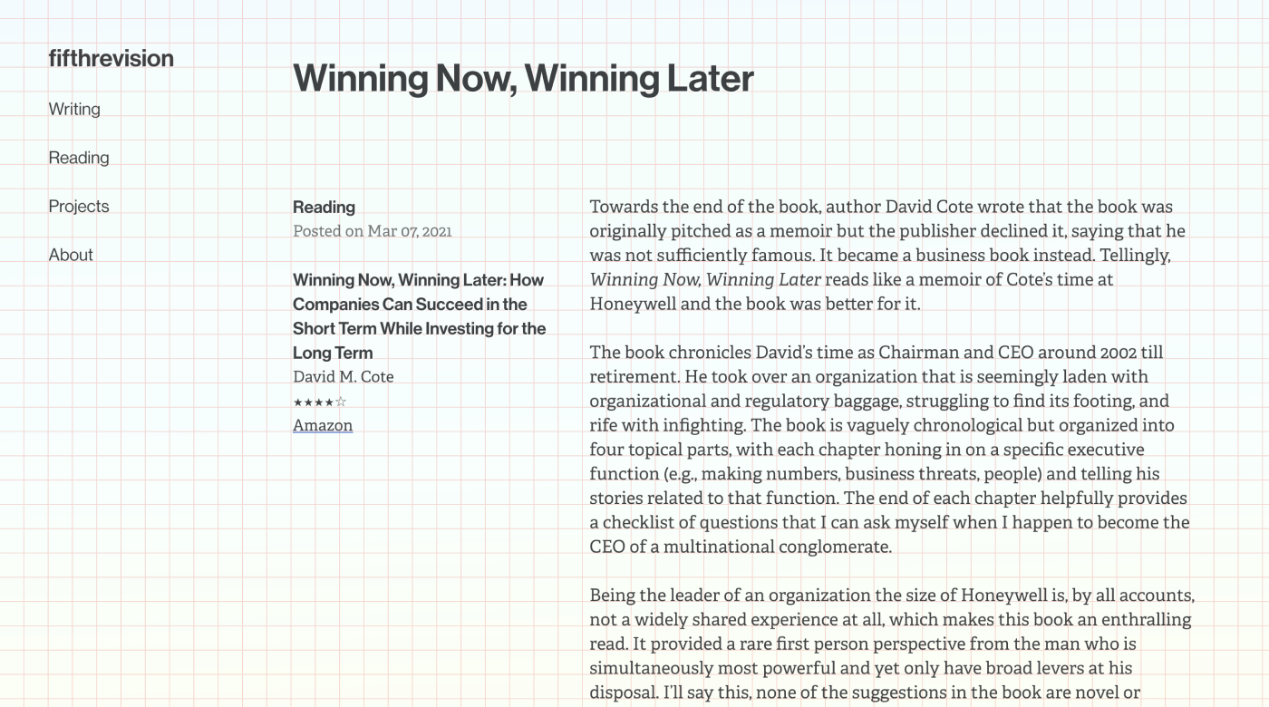
To further enforce the visual rhythm, which is defaced most acutely between horizontal peer blocks, I introduced a baseline to the page typography and realigned all elements to the baseline. With a few exceptions of half height margins (the unordered lists comes to mind), every piece of text snaps falls gracefully on an invisible baseline.

Baseline alignment bliss?
Baselines are difficult to implement, especially so in fluid layouts, and demands all other elements to conform to its tyranny. The needs of the page subsumes the needs of the individual blocks; there may be instances where an additional few points of space will benefit spacing between two elements, or a few points left, but these are all stricken out in favor of order. The end result provides the same satisfaction as one would get when watching disciplined soldiers marching in neat little rows in the parade.
A Long Tail of Small Tweaks
A new layout was introduced to differentiate between the different tablet orientations. The remaining breakpoints were rejiggered. Type colors and sizes were tweaked to balance between hierarchy and readability. A new color way was introduced in some content types. The images in the projects page has variable aspect ratios. I dropped some visual elements that were unnecessary. Paddings and margins were tweaked across the board to conform to the baseline.