My cofounder, Pete, and I got together in late 2015 to brainstorm a next project to pour our hearts into. We had both came out of a long term position at Microsoft and we wanted to look for something meaty to sink our teeth into.
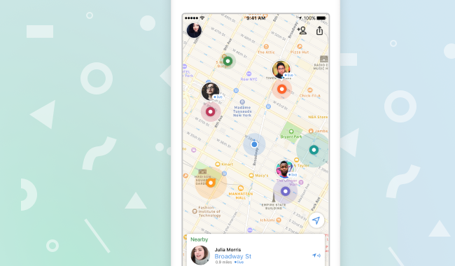
We quickly cycled through a bunch of ideas and eventually settled on the idea of being able to quickly find people in real life and reach out socially. The idea was not novel by any means but we felt that the technology stack was maturing. This was around the time when Uber became ubiquitous; calling a ride was but a tap on an app yet social coordination was clunky and clumsy. We got some early feedback and decided to pursue it full time.
TL;DR
- Organizing over medium to large social groups can be difficult as it involves a lot of detail finding.
- Having a shared context creates a shared basis for more frequent social interactions.
- We found that instead of fixed groups, most social groups are fluid. A map-first design is congruent with how people think in these scenarios.
Find my Friends
We were designing for people with busy social lives, typically in their late teens and early twenties. As we learned more about the space, a few interesting trends emerged: most people have a list of 4 to 5 friends that they consider close that they make plans and spend time with. This number held pretty consistently across people we talked to.
On the other hand, everyone participate in larger group gatherings that are less frequent but involved extended friend groups with changing membership. People are communicating to meet up, and these conversations often splinter into small groups as well.
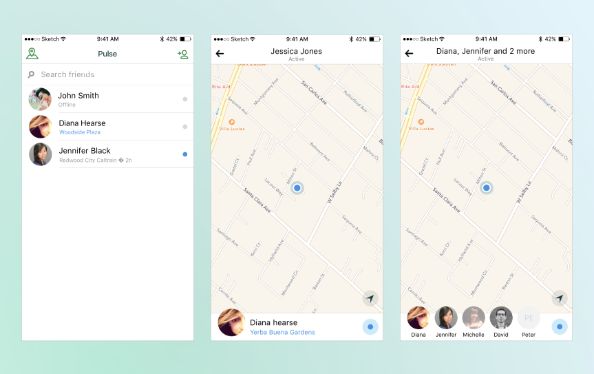
In the initial design, we landed on a friend list annotated with user locations. The user of the app will have an at a glance status of everyone, and groups, that she cares about.
List-first to map-first
The design proved the efficacy of our technology and concept tested the app with our early users. A couple of issues with the design came up:
- Users found the swiping between the list and the map clunky. We found that people would look through each friend and this involved a lot of back and forth.
- It was cumbersome to create a group for every social gathering. Because social events can be time bound and may have a different participant list each time, building groups each time felt like the wrong metaphor.
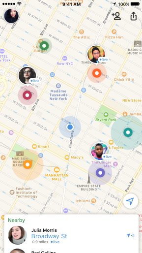
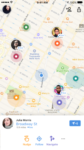
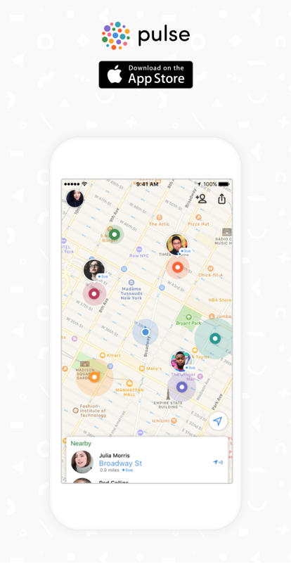
After iterating through design sprints, we settled on a radical idea. Like the marauder’s map in the Harry Potter movies, we were going to show where everyone the user is connected to is, in real time. For this change to happen, we will have to change how the product was architected on the back end.
In the original design, group membership constrained the amount of data that we have to collect. In this new design, we will have to get the location of everyone sharing their location to you. That had profound backend and frontend, especially battery, implications.
We shipped this design in our release later that year.


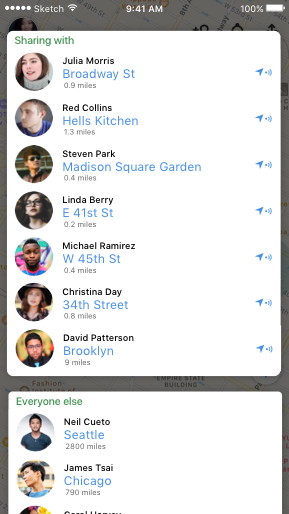

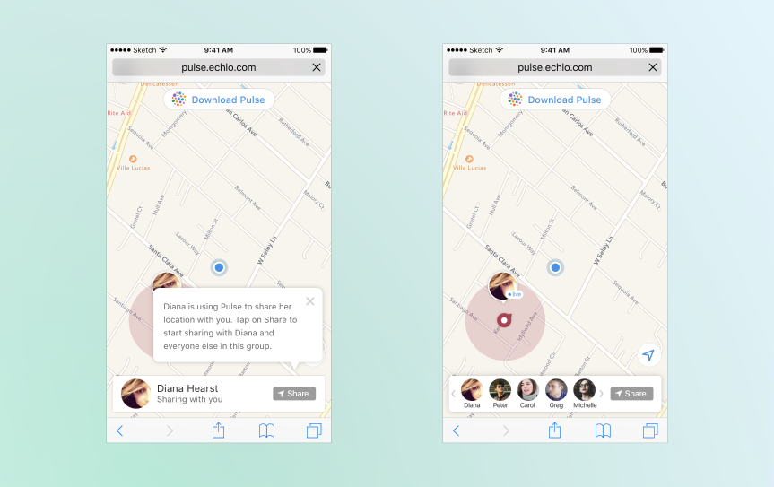
When you share a link with someone, they can temporarily share their location with you as well.
Logo and icons
To complete the design, I created a logo which also became the app icon. The logo was a dot circle with the varying sizes signifying the social groups that everyone possesses.
I created an icon set for the app. These vector icons represented concepts within the application and were designed to be readable on simple and complex backgrounds.

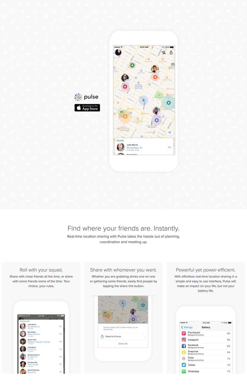
Website
Epilogue
Later that year, we learned that a startup called Zenly raised a Series A building a similar product. The fact that we arrived at the same design was gratifying, but the cash position difference was not. The company eventually sold to Snapchat for $213.3M in cash.
Shortly thereafter, both Facebook and Google announced live location sharing within their flagship apps. That pretty much marked the end of our little adventure.