Coming out of CMU, I joined Microsoft as a UX PM working on the Hotmail front-end web experience. My job as a PM is to work across engineering, marketing and other product and functional teams to ship features for Outlook.com. As a UX PM, we are additionally responsible for the interaction design of the features we ship. Over the years, as one of the few PMs responsible for UX, I’ve worked on almost every surface area of the product.

In 2014, as part of a large reorg in the company, the Outlook.com and the Office 365 email teams merged. As a result, the platform was unified under a new technology stack. The product however retained a lot of the UX improvements that we made as a team, making Microsoft’s web mail product a lot easier to use.
TL;DR
- Hotmail wanted to modernize and add features to satisfy all three different email personas: pilers, filers and zero-inboxers.
- As part of the modern redesign, the compose experience was rethought to take advantage of the screen real estate and have better file handling.
- To fit outlook.com into different workflows, we designed for every interaction modality and shipped features that can solve complex productivity scenarios.
Selected reviews
From the Wall Street Journal:
Microsoft’s new Outlook.com looks elegant and has a remarkably user-friendly interface. If you’re overwhelmed by a cluttered inbox, want a better way to sort emails or need an easier way to share photos and files, Outlook.com is a winner.
From CNET:
Outlook.com is the first free e-mail service I’ve seen that’s a direct and viable competitor to Google’s product. The interface couldn’t be easier to use, SkyDrive and social-media integration bring convenient levels of functionality (provided that you toy with the settings), and the instant filtering for specific messages is a boon for inbox organization. Photos and videos get welcome treatment, as well, and no will argue with the promise of unlimited storage. And just as importantly, Microsoft doesn’t just imitate Gmail, it makes Outlook.com its own.
From PC Mag:
Microsoft’s new Web-based email, Outlook.com impressed from the first moment we saw it. Its clear, fast user interface, leading tools for maintaining a clean, junk-free inbox, social-network integrations, and built in viewers for things like videos and documents were enough to earn it our Editors’ Choice immediately.
Our process
We worked in a waterfall process in those days, with each milestone running somewhere between 12 to 16 weeks. As PMs, our jobs is to take the business objectives assigned to us and translating it into specs, seeing that they ship and bringing the features to market. As email workflows are complex and we need to ensure that the specs are complete before coding begins, I have always built prototypes as part of building out the feature spec. I will then work with user researchers to bring these prototypes into the lab, show them to users that we recruit externally, validate and get feedback before we implement them.
Towards the end of my time there, I had a JavaScript prototype that I built that is fully functional from an interaction standpoint (it lacks a working data model and API compatibility with production). Alas, it did not survive.
Outlook.com, compose and files
I joined at the tail end of the Hotmail and the team was plotting a big redesign. We didn’t know what it was going to be called at first, but the team was hard at work at adopting the what was the called the Metro design language. This was during the same time when Windows 8 was under development. Eventually, the powers to be decided to name the service outlook.com, after the venerable email application.
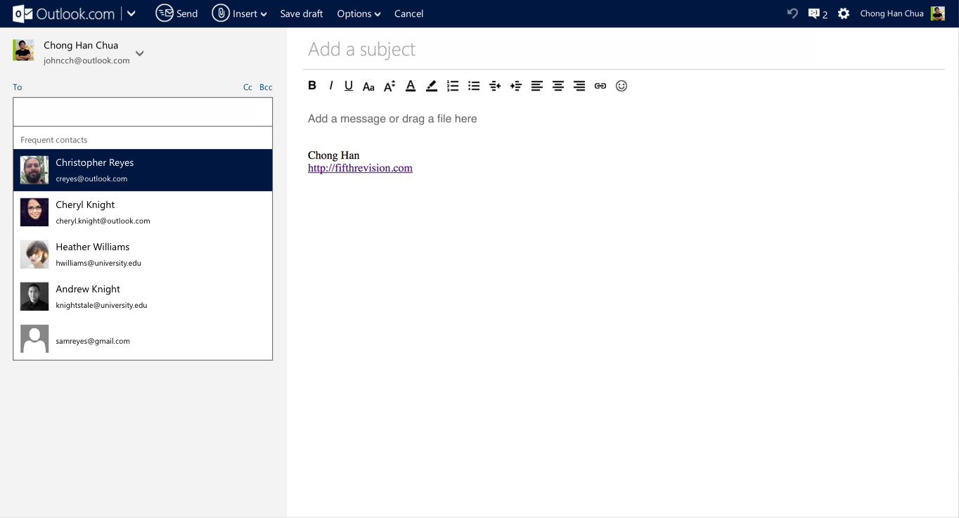
My first task with the team was redesigning the contact picker and the Compose page. Because the previous contact picker was an old ball of wax, we had the opportunity to revamp it. The new contact picker was designed to be accessible from both keyboard and/or mouse and supported single and multi contact selection. With the benefit of hindsight, the contact picker was honestly quite overkill for the user scenarios that we were supporting. For example, it was possible for the user to add contacts using the mouse, select two and delete them using the keyboard, and then switch back to the mouse to edit a contact. To make a spec like this possible, I built a fully functional prototype to tease out all the edge cases.
The design of the Compose page was controversial for its time. This was the first time any email client shipped a full page compose with a left-right layout. The intent was to provide a full page canvas so the user can focus on crafting her next great American email. One of the things I remember was that we spent significant amount of time debating whether to show or hide the formatting bar by default. Some wanted the screen to be complete devoid of distractions and hiding the bar every time the user enters the page. Others want the bar to be shown always. We settled the design by pulling (anonymized) user data; we found that only 20% of users used formatting, but they used them almost 80% of the time. We settled on a design where the formatting bar was hidden by default, but once you toggled it, the setting would be sticky. (It was amusing to see gmail go through the same design iteration in public when they shipped their visual update a few years later.)

Files, cloud files and animations
As part of the compose update, we added in drag and drop support for the first time. We had to support Internet Explorer 6 then (of course it did not work), and that was a lot of fun. The original file manager was written in Silverlight, which we eventually deprecated for a HTML5 version. We automatically saved large attachments to OneDrive (then SkyDrive) and eventually added the ability to attach files directly from OneDrive.
My favorite part of the entire redesign that I worked on was all the superfluous animations that we added as part of the web personality. Part of the Metro design language was to use animations to help the user understand the relationships between the various parts of the UI. As part of that, we concocting a ridiculous animation where when the user hits send, the entire HTML element shrinks and transitions upwards.
The overall look of Outlook.com is much cleaner and more refined compared to Hotmail. Fonts are larger and easier to read, and it has built-in, playful animations that made me want to send emails: Each time I hit Send, the whole message appeared to instantly shrink and be sent off away from me.
It stuck around the product for a while. Eventually the platform migrated and the animation was never ported over. A pity really.
Sweep, Categories and keyboard shortcuts
Sweep is the flagship feature for Outlook.com. It takes a specific email sender and removes it from the inbox, useful for clearing unwanted email from the inbox. It was a feature that was beloved by power users but not used very much outside that population.
In the original iteration, sweep was a family of features. There were multiple different entry points for the feature depending on the action (e.g. Move, Delete etc.) and each action presents a full screen dialog with multiple options. Even though our marketing materials constantly refer to Sweep, there was no single entry point where users can go. Furthermore, every time when someone uses the feature, they would have to make multiple decisions. The feature was bending under the weight of its complexity.
As part of the UX simplification, we teased out the usage data. Even though there were more than ten permutations of options, the use of the top four or five use cases dwarf the rest. With this new set of options, we were then able to reduce the feature down to a single button. If the default option was what you needed, you can now Sweep unwanted email out of your inbox in two clicks. The feature tested and performed well and was implemented across other Microsoft email clients.
Advanced Rules
After spending a lot of time making email easier to use, the team wanted to make sure the product was power user competitive as well. Even though outlook.com was targeted at consumers, we knew that there were not insignificant amount of people who use our product to conduct business and handle important matters.
Desktop Outlook had a powerful if not hard to use rules system that was well loved by many of its users. For us, Advanced Rules was conceived as an easier to use version of that. Furthermore, any rule that can be created by Sweep must be replicable in Advanced Rules as well. To ship this feature, it was a team effort to ensure that whichever permutation of rules the front end can make the back end could support.
Rule builders rarely makes an intuitive UI element. To make sure that users are not lost in the complexity, we had to test multiple versions of the design before landing on a one that worked. To further mitigate the fact that it is difficult for people to predict complex rulesets, we designed a UI flow for users to preview the email (that never shipped).
We created a blog post that highlighted the flexibility and usefulness of rules. Advanced rules was the last feature that I worked on with this team.