Honeycomb
2017-2019
Founded in San Francisco in 2015, Honeycomb provides observability tools to modern dev teams to better understand and debug production systems. The product is a hosted service with a robust query, data visualization and collaboration tools that works with high volume events from production engineering systems.
Background
I joined Honeycomb as employee #15. During my term, I’ve worked on everything from user research, information architecture, usability, new features, design systems and a brand and visual facelift. In addition, I advocated for and help hired in a designer skilled in data visualization since we are in the business of helping users make sense of their immensely large datasets.
This case study will focus on the work around reorganizing the product to make it easier to use and support future use cases.
Redesigning the Information Architecture
In one of our early user research trips, there was a memorable moment: we were in the offices of a customer when an engineering lead, Ken1, was showing off his use of Honeycomb. As the team ships software that focuses on super fast performance, Honeycomb was Ken’s go-to tool to debug uneven performance issues that may be hard to observe otherwise.
When Ken was giving us his demonstration, we noticed that he had a clunky workflow that started off with old queries bookmarked in his browser. When we quizzed him further, Ken confessed that he couldn’t figure out how to navigate the product. To our dismay, we had built in a similar feature within the product that went unused. The feature would be a perfect fit for that use case and had the further benefit of facilitating knowledge sharing within the team.
Goals & process
Our user research showed that sometimes even power users have trouble understanding how our product is structured and take advantage of all the features. Subsequently, we identified two goals in our redesign:
- Users should be able to quickly build intuition for Honeycomb. Our research found that users took a while to understand Honeycomb because our product employs abstract concepts that has little immediate relation to their problem domain.
- We want an information architecture that can more effortlessly support new and different work flows. Users should be able to make use of existing intuition and knowledge and take advantage of new workflows and tools.
I approached this task in a few steps. First, I sat down with Honeycomb users, went through every surface area, and listed down every concept (represented by a proper noun, like dataset) in the product. We then wrote these concepts down into sticky notes and asked other users to arrange them.
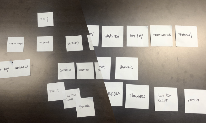
The results were illuminating. A few things stood out:
- Every user had a different idea of how datasets relate to other concepts like queries and boards within the product. As this was a key concept in the product, it makes navigation difficult to reason.
- There were concepts within the product that did not map to business realities. For example, the current product prioritizes lightweight teams but almost all our billing relationships are at the team level.
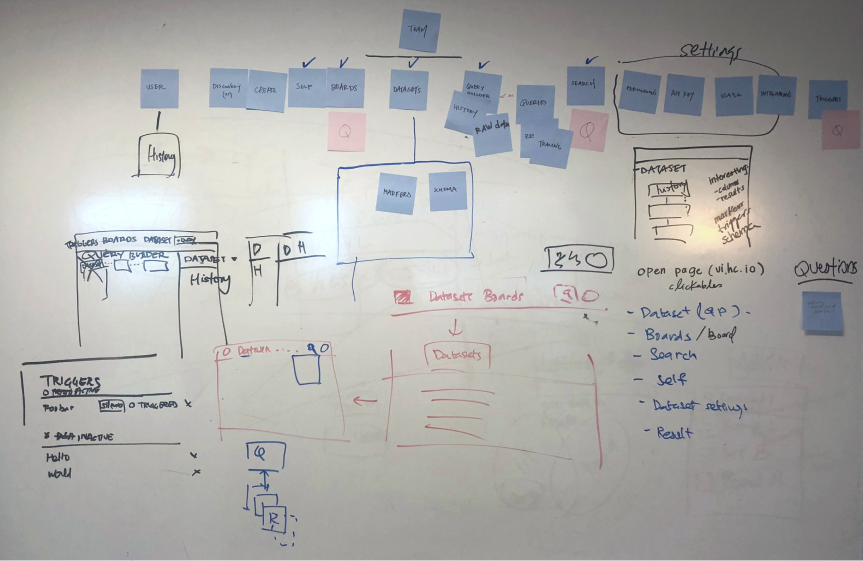
Taking the findings, I then spent time prototyping different designs, creating click through prototypes and tested them with our customers.
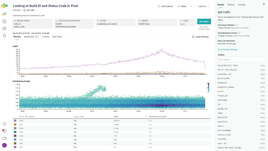
Reaching for the sidebar
Introducing a change that fundamentally restructures the product is never easy. While the final information architecture calls for other alterations, the first bit, which included a new navigation, was shipped shortly after. Three main things stood out in the change.
- From the aforementioned observation, team changed from being an explicit namespace to an implicit context. Every concept in the product now ties to a team and changing that changes visibility and access.
- We made a stronger distinction between Dataset and Queries. Dataset maps to a logical system that is being instrumented(such as a service in a microsystem architecture) and Queries represents discrete questions that is asked of it.
- A new navigation bar was introduced with each key concept like queries and datasets having their own section. This way, each feature is easier to get to and has more pixels to flesh out the design intent and serve the user better.
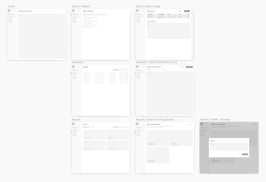
The screenshots below illustrates the before and after.
Bringing it all Home
The design was well received. In the last act, I designed a new landing page experience that took full advantage of the redesign to bring an easy-to-use out of the box experience for new customers.
While Honeycomb was powerful, there can be a steep learning curve. To make it easy for new user to tap the product’s full power, we wanted to have starter experiences where users can get immediate value with minimal configuration.
After talking to users, we found that Honeycomb investigations often occurs in two phases. Users start with a few top level measures that represents the health of their system. When an anomaly is detected, they then dive in, slice and dice to figure out the root cause. For many engineering teams, top level measures tend to be similar and not too different.
The new landing page feature takes three to four key measures of engineering systems and provides common and configurable dimensions to slice them by. When a new user creates a dataset from an engineering system, the page gets populated automatically. Users can easily jump between services by switching datasets, and tackle anomalies by going deep into the query builder.
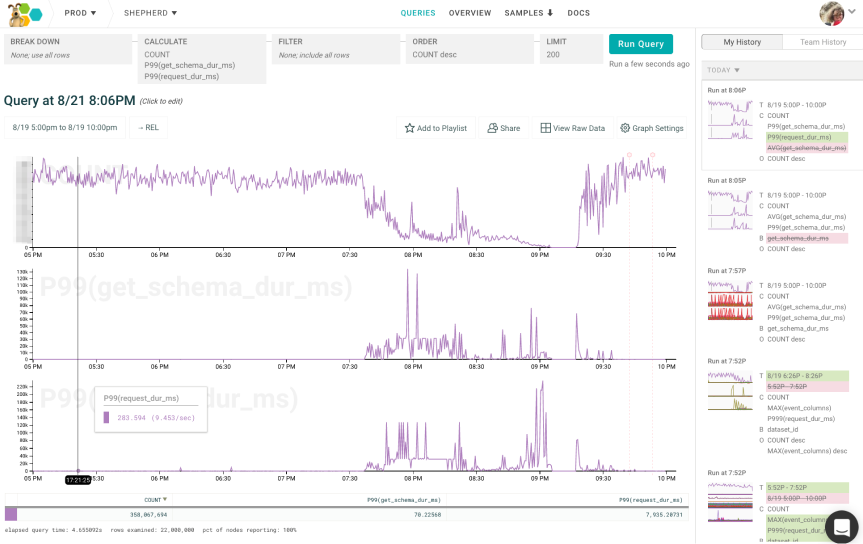
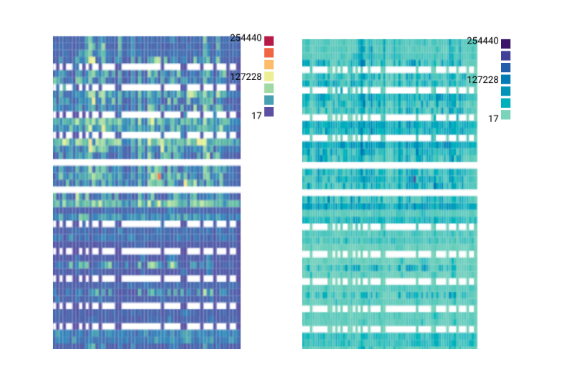
Epilogue: re-coloring heat map for readability
Let me share one of my favorite piece of design work.
When heatmaps shipped back in the day, it used cold and hot colors at both ends of the scale. Our specific implementation had a couple of quirks:
- Both the hot and cold end of the color palette used brightness as steps where extreme values were darker. However, due to the way our eyes perceive color brightness, colors in the middle of the scale tend to stand out when plot together.
- The low end of the spectrum uses a deep dark blue. However, zero values are not rendered onto the heat map. This means that if we have a heatmap where there are a lot of low values, the heatmap becomes visually significant. This is counterintuitive in that the visual significance does not translate to data significance.
It took me a while. Two color scales tend to have similar issues as above unless the data has both positive and negative values. Rainbow color scales are difficult to read because we are unable to intuitively map colors to values. After a lot of iteration, we settled on a two pronged solution. A narrow band of colors that is distinct enough to make it easy to recognize yet narrow enough to be perceived as similar. Values are represented by the lightness of the color. We also had to make sure that the lowest color of the spectrum was strong enough to be detectable as an outlier, yet not strong enough to dominate.
This ended up being a tiny technical change, merely updating a few hex codes in a single file. The result, however, was gratifying.
-
Names changed to protect the innocent. ↩