Redesign log: Grid and Type
Honestly, grids are hard. Like, really hard. Good grid work is so invisible. But yet when it is absent it screams at you. Well, more like at your eyes, but you get the idea.
I am obsessed with the idea of fluid grids. A lot of my web design and many revisions of this site has always been set on rigid grids, 960-ian in the early days and bootstrap-ian more recently. The first revision of this series of design had a fixed two column masonry layout. I couldn’t remember if the content changed sizes with the screen width (probably not), but there weren’t more than two columns at any time.
Going fluid
Rigid grids have a lot of benefits. It makes layout predictable. When using a graphical design tool, the designer can be confident that the final output is pixel perfect. To accommodate different screen sizes, the designer merely has to repeat the work a few times, making layouts for different grid configurations.
However, the web is squishy. Monitor sizes and screen resolutions are increasing. More importantly, browser windows are malleable and can exist in different configurations. These days, I often see web pages where a thin column of content is flanked by two white space wingspans, which is made much more comical on a fashionable ultra wide monitor.
Two thoughts: One, grid rigidity serves the designer but does not adapt to the needs of the user. It artificially constraints the content to design as opposed to the device that the user is using. To put it differently, it’s like serving a desktop page on a mobile site.
Secondly, there are a lot more design tools at our disposable on the web. CSS Grids comes with a wide arsenal of tips and tricks that are moldable to page breakpoints. Relative type sizes accommodates screen ergonomics that may demand larger or smaller text sizes.
I needed a design that could support multiple different content types on the front page. For a while, the portfolio and blog was on a different tab. There was a disconnect between the two spaces and the design wasn’t clear on how they related to each other.
The three column layout worked. The additional structure gave me space to add new content such as a short intro and work highlights. The content flows as page width changes, and it adapted to the various form factors.
2020, a refinement
In the most recent revision, I wanted to address a couple of issues that bugged me: The concept of having different type hierarchy is sound in theory. In practice however, I’m not sure if the difference was discernable and recognizable but contributes to a certain sense of discord in the page rhythm. In addition, the grid implementation was haphazard. Certain columns were fixed while the others scaled non-linearly. The result was the page looked good at certain resolutions but contort awkwardly in others.
To fix the visual rhythm, I had to pay attention to the baselines in the page. One of the obvious mismatches was two blocks of text side by side, each with a slightly different font size. While there was a logic to it, the hierarchical outcome did not warrant the rhythmic dissonance. Instead of intentional, it looked sloppy instead.
On the other hand, the main title is slightly larger compared to the rest of the headings in the page. This helps the title provide the gravitas and visual anchor that is necessary to anchor the rest of the elements of the page.
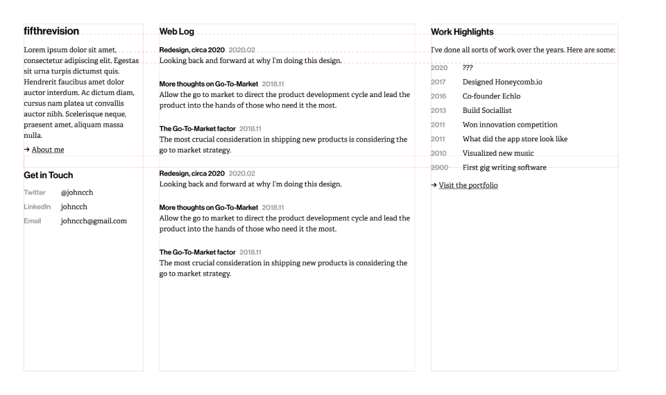
As for grids, I simplified the formula used to calculate the space distribution and rejiggered the break point and type sizes. In the end, the simpler solution won out.
It has taken me a while, and the end result is a grid and type system that is much more simplified and yet visually more pleasing to read and work with. There are endless things to tweak, and there are various aspects of the design of the grid, type and the way the page scales that does not sit well with me. At some point, a man has got to stop tweaking the layout and start writing blog posts. knowing myself, I’ll probably give the layout another go at some other point in the future.
A note about the present circa July 2020: I recognize my immense privilege in being able to write about grids and type in the midst of a severe pandemic and social unrest especially in the United States. I have been following the news closely and am continuously horrified by the actions and inactions of our elected officials.
This time period in history has significantly upended a lot of what I believe to be true. There has been rumblings about tech that I’ve always paid some attention to, but it seemed like stress points like this really exposes the inequality, injustice and more importantly cowardice that we have allowed to continue in the name of progress. I’m not sure what that means for myself yet; that may be a blog post for next time.